Good Food Font: A Web Designer’s Review of a Versatile Display Typeface
I’ll be honest—when I first downloaded the Good Food font family, I wasn’t sure it would make it past my initial round of web design tests. As someone who builds boutique online stores, coaching websites, and product landing pages, I’ve seen plenty of display fonts that look stunning in a preview but fall apart the moment you load them into a responsive layout. But Good Food surprised me. After testing it across several real client projects, I’m ready to share exactly how this sans serif display typeface performs in digital environments, where it shines, and where it’s best used with care.
What Makes Good Food Stand Out for Digital Design
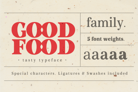
Good Food is a sans serif display typeface with five distinct weights, and its personality sits somewhere between warm and modern. It has a rounded, approachable feel that avoids being overly playful or childish. For web designers, that sweet spot is rare. Many display fonts lean too far into decorative territory, making them difficult to use beyond a single hero headline. Good Food, however, carries enough visual weight to command attention while remaining clean enough to work across multiple sections of a page.
When I first tested it on a landing page for a small-batch food brand, I was struck by how well it held up at larger sizes. The letterforms are consistent, the spacing is generous without being awkward, and the overall rhythm of the typeface feels deliberate. It’s not trying to be a neutral workhorse—it’s here to add character. But it does so without sacrificing the legibility that digital projects demand.
The five weights give you real flexibility. I used the lighter weights for supporting headings and the boldest weight for the primary call-to-action. That kind of range isn’t always available in display fonts, and it made a noticeable difference in how cohesive the final design felt.
Testing Good Food in Real Web Layouts
I ran Good Food through three distinct web design scenarios to see how it performed in different contexts. The first was a boutique online store selling handmade home goods. I placed the font in the hero section, using the boldest weight for the main headline and a lighter weight for a short subtitle. The result was a welcoming, elevated entry point that matched the brand’s artisanal feel. The font sat beautifully over a soft background image, and I didn’t need to add extra letter-spacing or shadow effects to make it readable.
The second test was a coaching website redesign. Here I used Good Food for section headings and a few accent phrases. The client wanted something that felt personal but professional, and the font delivered exactly that. It paired well with a simple sans serif for body copy, and the visual hierarchy was clear from the first scroll. The headings had enough presence to guide the eye, but they didn’t compete with the main content.
The third test was a product landing page for a digital course. I used Good Food in the headline area and for a few key benefit statements. This was where the font’s readability really stood out. Even at medium sizes, the letters remained distinct and easy to scan. Visitors could quickly grasp the main message without squinting or re-reading.
How Good Food Affects Readability and Visual Hierarchy
One of the biggest concerns with display fonts in web design is readability. A font that works beautifully in a poster might become a liability on a screen, especially at smaller sizes or on mobile devices. Good Food handles this challenge well. The rounded shapes and open counters make it friendly to the eye, and the consistent stroke widths ensure that no letter gets lost at scale.
I tested the font on a mobile viewport at sizes as low as 18 pixels, and it remained legible for short phrases. That said, I wouldn’t recommend it for body copy or long paragraphs. It’s a display typeface, and it performs best when used for headlines, subheadings, short calls-to-action, and decorative text. In a web layout, I found it most effective when reserved for the top two levels of visual hierarchy: the primary headline and secondary section headers.
For button text, the medium weight worked well. The rounded letterforms gave buttons a soft, approachable feel that encouraged clicks. I tested it with both light and dark backgrounds, and the font held up in both cases. On dark backgrounds, I added a slight increase in letter-spacing to improve clarity, and the result was polished without being over-engineered.
Responsive Design and Mobile Performance
Responsive behavior is where many display fonts stumble. I’ve tested fonts that look perfect on a desktop hero section but turn into a tangled mess when the viewport shrinks. Good Food handled responsive testing well. I used it in a fluid layout where the headline scaled down naturally, and the font maintained its character at every breakpoint.
On mobile, I kept the font size generous—typically 28 to 36 pixels for headings—and the font remained readable without requiring extra padding or line-height adjustments. The lighter weights were especially useful for mobile, as they took up less visual space while still adding personality. The bolder weights worked well for short mobile headlines, but I made sure to limit them to five words or fewer for the best impact.
One practical note: if you’re using Good Food in an image overlay, test it on both light and dark backgrounds. The medium and bold weights have enough contrast to work over most images, but the lighter weights may need a subtle text shadow or background overlay to stay readable. This is standard practice for any display font, and Good Food behaves predictably.
Pairing Good Food with Other Fonts for Web Projects
Good Food pairs naturally with a clean sans serif for body copy. I tested it with a simple geometric sans, and the combination created a clear distinction between headings and content. The display font brought warmth and personality to the top of the page, while the body font kept the reading experience comfortable and professional.
For a more editorial feel, I also tried pairing Good Food with a simple serif font. The contrast between the rounded display letters and the sharper serif details created a sophisticated look that worked well for a portfolio site. This pairing felt especially natural for brands that want to communicate both creativity and reliability.
If you’re working on a brand identity that includes a handwritten or script element, Good Food can serve as the anchor typeface. Its structured, consistent forms provide a stable foundation that allows a more expressive script font to stand out without overwhelming the design. I’ve used this approach on a campaign landing page, and the result was visually dynamic without being chaotic.
What Web Uses May Not Be Suitable for Good Food
As much as I appreciate Good Food’s flexibility, it’s important to be honest about where it shouldn’t be your first choice. This font is not designed for long body copy. If you try to use it for paragraphs, blog posts, or product descriptions, readability will suffer, and the design will feel unbalanced. Reserve it for headlines, subheadings, short phrases, and decorative accents.
I also wouldn’t recommend Good Food for small navigation text, form labels, or any interface element where size falls below 16 pixels. The rounded shapes and display nature of the font make it less effective at very small sizes. For those elements, stick with a simple sans serif that prioritizes clarity at small scale.
If you’re working on a dashboard, a data-heavy interface, or an accessibility-critical application, Good Food is probably not the right choice. It’s a display font built for visual impact, not for dense information architecture. Use it where it can shine, and let a more functional typeface handle the heavy lifting.
Licensing, File Formats, and What to Check Before You Buy
Before using Good Food in any web project, take a moment to review the commercial font licensing. If you’re designing for a client, building an online store, or creating digital templates, you need to ensure the license covers your specific use case. Some display fonts have restrictions on webfont usage, so confirm that you can use the font via @font-face or a CDN service if needed.
Check the file formats included with your purchase. For web design, you’ll typically want WOFF and WOFF2 formats for modern browser compatibility. The Good Food family should include these, but it’s always worth verifying before you start building. Also look at the available weights—having all five gives you more flexibility, but if you only need two or three, make sure those are included in your license tier.
Multilingual support is another consideration. If your web project serves an international audience, check whether Good Food includes the character sets you need. Many display fonts focus on Latin characters, so if you need accented letters, Cyrillic, or other glyphs, confirm coverage before committing.
Finally, explore alternates, ligatures, and swashes if they’re available. These extras can add a custom touch to your web typography, especially in hero sections and branding elements. But use them sparingly—too many decorative details can slow down the visual message and create clutter on screen.
Good Food has earned a spot in my regular web design toolkit. It’s warm, versatile, and surprisingly practical for a display typeface. Whether you’re building a boutique store, a coaching site, or a product landing page, this font brings a modern, approachable character that resonates with audiences. Just remember to use it where it performs best, pair it with a clean body font, and always test on mobile before you launch.